Alabama Agricultural & Mechanical University
Institutional Rebrand
160over90
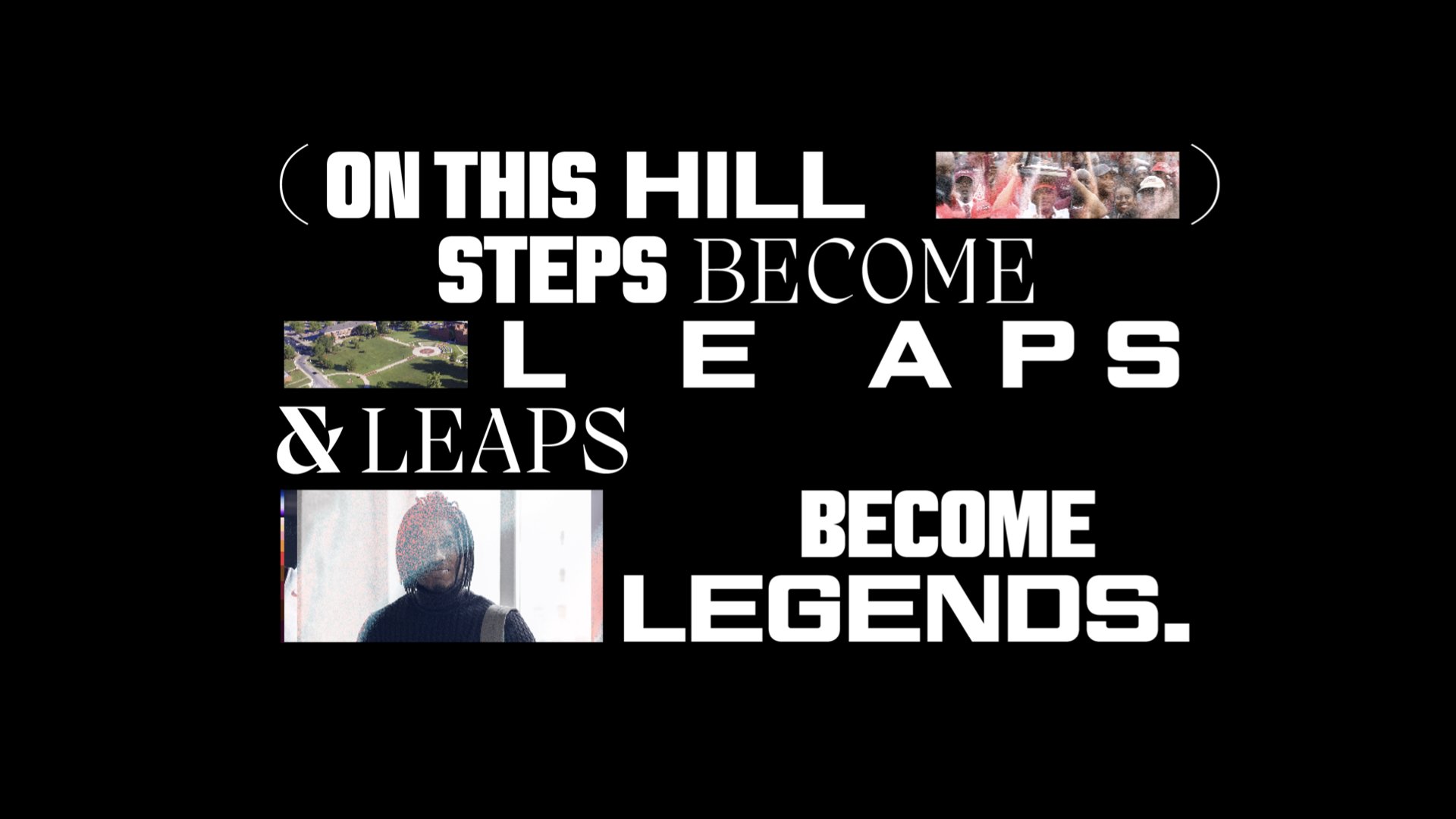
AAMU got the juice.
You don’t understand power and determination until a 19 year old student from Normal, Alabama looks at you dead in the eyes and says: “The haters are going to know my name. I’m going to become a legend one day.”
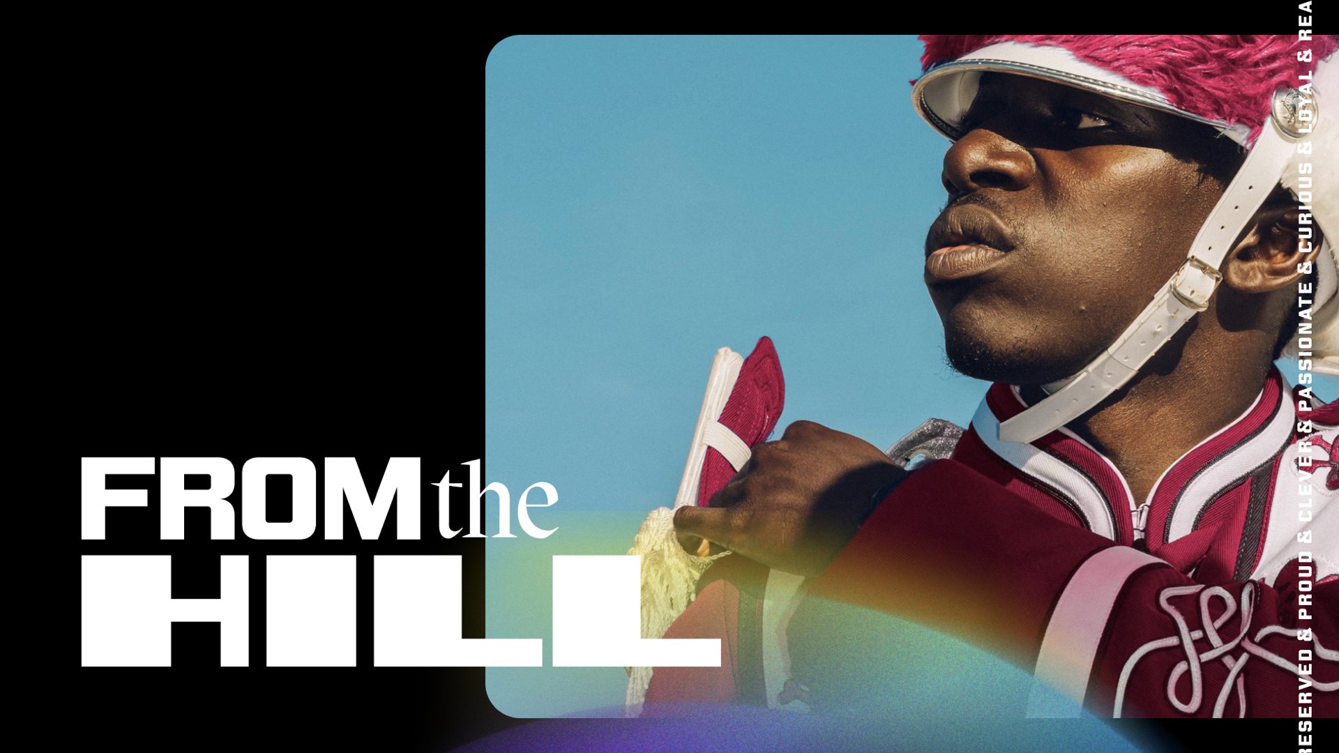
It was in that moment, we knew our brief: Give this HBCU in rural Alabama some juice. A platform for their stories to be seen and felt. From the Hill became the rallying cry. Because greatness happens on the Hill, and from this Hill, greatness can be felt by all.
Together with our partners at AAMU, we created comprehensive brand elements, landing page, on-campus signage, and a hype video to name a few, along with a robust set of assets for the school to continue expanding the brand throughout the university community.
We did our best to embody all that AAMU stands for. A dynamic, energized group, that were getting it done. There was swagger, no-nonsense and joy, all rolled together.
We explored what it means to exemplify the color rich black, and how we could use immense color to capture the essence of Black.
Because Black isn’t ever just one thing.
It’s all of these things together. Energy and movement was captured, even in the most static of examples.
Image Credit: Getty Images,
AAMU was originally located in central Huntsville, Alabama (now, a somewhat bustling hub with transient international business folks and scientists visiting NASA, Boeing and other government agencies), and about 50 years into operation was asked to move to larger, albeit awkward, piece of land atop a hillside, approximately 5 miles away. This request was a symbol of the school's success, but also a response to the growing white population in Huntsville proper.
Today, the Hill is a critical symbol of the spirit of AAMU. It is the heart and soul of campus, the home of the Divine Nine, and where the echos of steps originate.
It is from this Hill that you see, and be seen.
Image Credit: AAMU


Two display fonts were used for this project. The first from Vocal Type and is designed by founder Tré Seals. The Neue Black is a typeface that was created in collaboration with artists and designers through The Art of Blackness exhibition.
“[The Neue Black] was based on the signage of Martin Luther King Jr's and the Southern Christian Leadership Conference (SCLC) Chicago Freedom Movement, a campaign that marked the expansion of their civil rights activities from the South to northern cities.”
- Tré Seals
The second display font is Migra from the Pangram Pangram foundry, and is designed by Valerio Monopoli. Immediately, we were drawn to the ampersand.
The ampersand represented critical elements of the brand: the multiplicities of being Black excellence. The perpetual energy that comes with an education from AAMU. The endless opportunities and impact that any one individual can have on this world.
And the Migra ampersand did it for us.

Credits //
Group Creative Director: Brendan McGann
Creative Director: Juliana Lynch
Associate Creative Director: Jason Donahoe
Associate Creative Director: Jess Eversemeyer
Art Director: Khiari Bakar
Copywriter: Catherine Northington
Motion Designers: Paula Rodriguez, Joseph Dunlap
Senior Account Director: Sam Thompson
Senior Account Executive: Jason Gallagher
Strategy Director: Sarah Desiderio
Senior Strategist: Leon Tambue
Project Manager: Lavon Coker
Project Director: Candace Branch
Video Operations Manager: Andrew Nigrelli